




Borgognotta Carlotta VIP
Flat band
Cap.
750
Col.


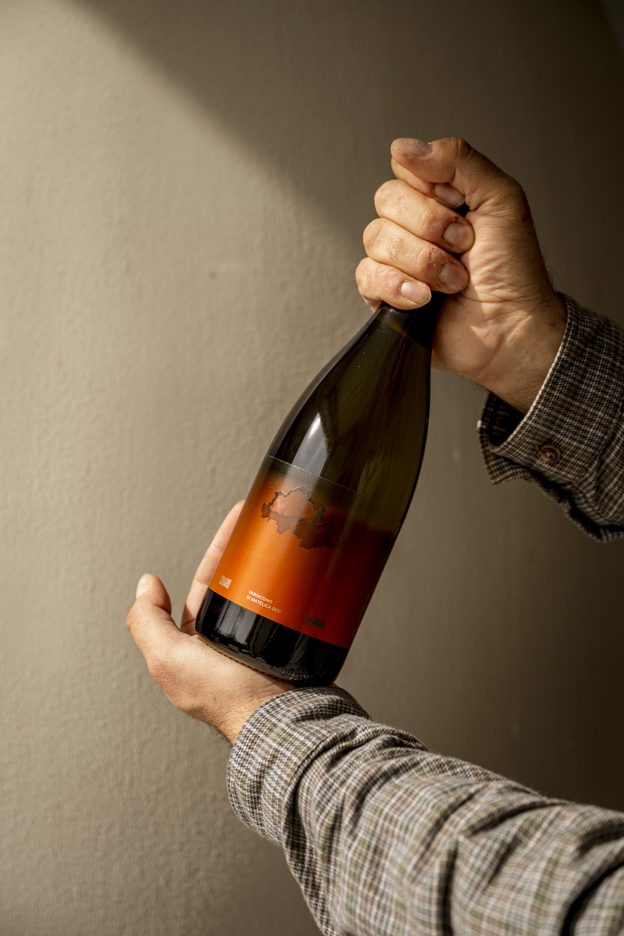
Carlotta VIP: a Burgundy wine bottle with a contemporary design
At the foot of Mount Gemmo, at approximately 600 meters above sea level, Cantina Illimita is born. This winemaking project is deeply rooted in the Matelica area and has a specific philosophy: seeking the essence of wine through careful selection, eliminating the superfluous to make room for authenticity.
This vision is also expressed in the packaging of Chiaro e Scuro, for which Cantina Illimita chose Carlotta VIP Fascetta Alta from the SAIDA Collection, an elegant and contemporary Burgundy wine bottle, capable of interacting with the unique label design project curated by Stefano Bracci.
When developing wine packaging, the choice of bottle is one of the first elements around which the entire visual project is built.
Shape, proportions, shoulder, and neck define a precise aesthetic language, with which the label, materials, and finishes must be able to communicate coherently.
For Cantina Illimita, the choice fell on Carlotta VIP Fascetta Alta, a Burgundian bottle from the SAIDA Collection characterized by balanced proportions and a contemporary style.
Its elegant silhouette creates the ideal base to complement the label design without overpowering it, contributing to the creation of a recognizable and harmonious overall packaging.
The graphic design by Stefano Bracci for Chiaro e Scuro interprets one of the most characteristic elements of the landscape where Illimita wines are born: the clouds that descend towards the vineyards and continually alter the perception of light and the land.
From this inspiration comes a dynamic label, designed to transform along with the bottle.
The cloud appears on the label when the wine reaches the ideal serving temperature, then gradually fades as the temperature rises.
A simple yet powerfully narrative interaction, it brings an element of the landscape to the bottle and transforms it into part of the product experience, adding an innovative functional aspect.
It is precisely in the relationship between the bottle’s shape and the graphic design that Cantina Illimita’s packaging finds one of its most interesting elements.
The Carlotta VIP Fascetta Alta offers an elegant and contemporary structure on which the label design can fully express its identity. The bottle thus becomes not a simple support for the label, but an integral part of the composition.
A fundamental principle in packaging design: the bottle and label should not be considered as two independent elements, but developed so that the shapes, proportions, materials, and graphics contribute to the same perception of the product.


